
Communicating uncertainty
Main messages
When publishing statistics with associated uncertainty, you should:
- Be transparent: Draw attention to any uncertainty in your reports and accompanying spreadsheets to avoid misinterpretation and misuse.
- Be specific about what exactly is uncertain: Explain why there is uncertainty in an estimate, how the uncertainty has been quantified, the limitations of the data and any assumptions made in the analysis.
- Indicate uncertainty using numerical ranges in parentheses after each value with associated uncertainty.
- Use plain and accessible language: Make sure that when you write about uncertainty it can be understood by all.
- Visualise uncertainty: Show uncertainty in your data visualisations and explain to readers what the uncertainty represents.
This page is based upon a range of sources from across government and beyond. For a reading list, please see the sources section towards the bottom of this page.
What do we mean by uncertainty?
The method by which we gather information about the world is characterised by assumptions and limitations. These assumptions and limitations introduce imprecision into our understanding and mean that any estimate we make to describe real-world phenomena or conclusion we draw is unlikely to be the “true value”, even when based on sound data and appropriate methods. The difference between our estimate and the “true value” is what we mean by uncertainty.
Uncertainty can arise from multiple sources including sampling variation, measurement error, systematic biases and assumptions made in statistical models.
The Winton Centre for Risk and Evidence Communication at the University of Cambridge distinguishes between two levels of uncertainty: direct and indirect. Both direct and indirect uncertainty are crucial to consider when communicating uncertainty in statistics and data.
Direct uncertainty
Direct uncertainty refers to uncertainty about an estimate (or fact) that can be communicated in absolute terms (such as a standard error, confidence intervals, credible intervals and statistical significance). Direct uncertainty is uncertainty that is explicitly measured or quantified during data collection or as part of data analysis.
For example, taking the estimate of disease X positivity in the UK, the direct uncertainty would be summarised by including a range within which the true value is expected to lie. We would write this as “disease X positivity was estimated to be 2.3% (95% confidence interval: 1.9% to 2.7%).”
Indirect uncertainty
In contrast to direct uncertainty, indirect uncertainty refers to uncertainty about the underlying quality of evidence that forms the basis for any claims about the estimate (or fact). It is not directly measured or quantified but is inferred from uncertainties associated with the analysis. This will often be communicated as a list of caveats about the underlying statistics or data, or it can be summarised into a qualitative or ordered categorical scale (such as the GRADE scale for communicating the quality of underlying evidence about the effects of medical interventions).
The indirect uncertainty would cover how the data had been collected and analysed, measurement error, historical revisions due to missing data or under-reporting of a group or region. Typically, this added context can be found in the main body of a publication and/or in a quality and methodology information (QMI) report.
Why uncertainty matters
Uncertainty is an inherent part of statistics and data, but it can directly influence our interpretation of their reliability. This is because, as humans, we have a particular dislike for ambiguity and a natural preference for facts. The reason is straightforward: people naturally (and rationally) prefer to make decisions when they have all the relevant information and are confident in their knowledge. The term uncertainty itself can lead to suspicion and is often misinterpreted, implying that the statistics are of little value or incorrect.
For the public, uncertainty in numbers and what it means for their use can be difficult to grasp, and this can affect public trust in statistics and the organisations that communicate them. For statistics producers, being honest, open and up front about uncertainty can help to minimise misinterpretation, maintain confidence, and protect the integrity of the data, the analysis, and the communicator.
The Code of Practice for Statistics commits statistics producers to the highest standards of quality in statistics. The Quality pillar of the Code contains practices for communicating uncertainty that all producers should be mindful of. See inside the expandable sections below for more detail on these principles.
In addition to the Code of Practice for Statistics, ensuring that uncertainty in statistics and data is clearly explained is a key pillar of the Office for Statistics Regulation’s regulatory guidance on intelligence transparency. For more information on why uncertainty matters, also see the Uncertainty Toolkit for Analysts in Government.
Common measures of direct uncertainty in statistics
This section introduces common measures of direct uncertainty (such as standard error, confidence and credible intervals and statistical significance), what they mean and how they are calculated.
Stock text definitions are given at the end for use by statistics producers in their publications. All feedback is welcome.
Variance
Standard deviation
Standard error
Confidence intervals
Credible intervals
Statistical significance
Communicating uncertainty
For any analytical outputs that communicate variance, standard deviation, standard error, confidence intervals, credible intervals, and statistical significance (p-values), analysts and authors should be transparent, be specific, use numeric ranges, and use plain and accessible language.
Be transparent and specific
Transparency and clarity support public confidence in statistics and minimises the risk of misinterpretation.
Draw attention to any uncertainty throughout your reports (text, charts, tables) and accompanying spreadsheets.
Explain why there is uncertainty in an estimate and how the uncertainty has been quantified.
Be specific about the limitations of the data and any assumptions made in the analysis.
Use numeric ranges
Words like “estimated” or “around” alone do not accurately describe the degree of uncertainty in an estimate.
When reporting a figure include:
- the range of uncertainty after the main value
- the measure of uncertainty: for example, are you presenting standard error or a confidence or credible interval?
- the level of uncertainty: for example, are you presenting a 50% or 95% confidence interval?
To give an example, “unemployment is estimated at 3.9%” should be written “unemployment is estimated at 3.9% (95% confidence interval [CI]: 3.7% to 4.1%)”. This will ensure that the user has all the relevant information needed to accurately understand and interpret your statistics.
Use plain and accessible language
Statistical commentary should describe general trends clearly and succinctly, and put any uncertainty in context.
You can use the Professional Head of Intelligence Assessment (PHIA) Probability Yardstick when making probability judgements. The Yardstick relates numerical probabilties to terms such as ‘unlikely’, ‘probable’ and ‘highly likely’.
Contextual information should be used to provide an indication of:
- the quality of the statistics
- the level of uncertainty in the statistics and data
- how the level of uncertainty impacts their interpretation, comparability and appropriate use
Provide definitions and explanations of terms that may be unfamiliar to your audience. Definitions of standard deviation, standard error, credible and confidence intervals, and statistical significance (i.e., p-values) can be found at the end of this guidance.
Visualising uncertainty
Data visualisations should include aids such as shaded ribbons or error bars to represent uncertainty. This is a simple yet impactful way of communicating uncertainty in statistics or data. The choice of visualisation method depends on:
- the nature of your data
- the level of detail you want to convey
- the familiarity of your audience with different chart types
When visualising uncertainty, you should consider all three.
The meaning of the error bars or shaded ribbons should be clearly explained below the chart, with any additional information for the user at the end of the report or in a separate QMI report.
The guidance below presents three different ways of visualising uncertainty in a chart (ribbon chart, fan chart and error bar chart) and highlights typical use cases and their advantages and disadvantages. Experimenting with multiple visualisation techniques can help you find the most effective way to communicate uncertainty in your specific context.
Please also see our guidance on data visualisations for how to format charts accessibly.
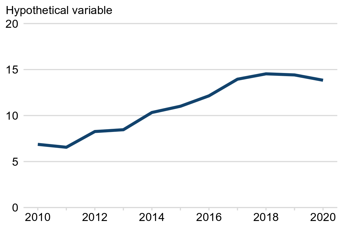
❌ No uncertainty: not recommended
Example 1 shows an illustration of a chart showing no uncertainty. Year is on the x-axis and some hypothetical variable on the y-axis. Only the central line (representing the average) is shown and there is no indication of any uncertainty in the data. Presenting the statistics in this way could mislead users by inflating their confidence in the accuracy of the data.
Example 1: Hypothetical variable, England, 2010 to 2020
✔️ Ribbon charts
Displaying a line plot with a shaded ribbon around it can effectively communicate uncertainty without being too distracting. The line shows the central estimate while the ribbon represents the uncertainty.
We recommend that ribbon charts are used to visualise uncertainty on line charts, with a note included underneath each chart to explain what the ribbon (shading) represents.
In Example 2, the blue line represents the central estimate while the grey ribbon represents the 95% confidence interval. The wider the ribbon, the greater the uncertainty.
Example 2: Hypothetical variable, England, 2010 to 2020
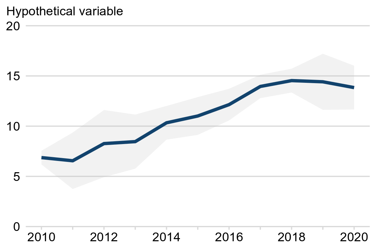
Note: the grey shading represents 95% confidence intervals.
Care should be taken when plotting multiple lines on a single chart to ensure that there is sufficient contrast between colours. Small multiple charts may be more appropriate and avoid clutter.
✔️ Fan charts
Fan charts are commonly used to show forecasted data but are also useful if you wish to convey more detail. A fan chart displays a central line and shaded ribbons representing two or more levels of uncertainty. The wider the ribbons the larger the uncertainty.
Example 3 shows an example of a fan chart. The blue line shows the central estimate while the shaded ribbons show 50% and 95% confidence intervals in dark grey and light grey, respectively.
Example 3: Hypothetical variable, England, 2010 to 2020
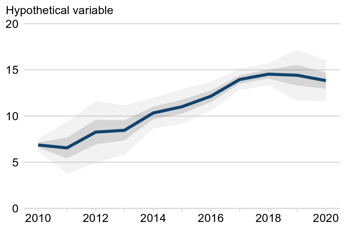
Note: the light and dark grey shading represent 95% and 50% confidence intervals, respectively.
Chart 5.1 on page 35 of the Bank of England’s inflation report from November 2017 shows a good example of a fan chart with three levels of uncertainty. Prior to 2017, the shaded ribbons reflect revisions to historical data while after 2017 the shaded ribbons reflect uncertainty in the future projection.
With a fan chart consider if your audience would benefit from more than one confidence interval or whether one level (typically 95%) is sufficient.
✔️ Error bars
Error bars are a classic method for representing uncertainty that can be used in multiple chart types. They can be used to indicate the minimum and maximum values (range), interquartile range, standard deviation, standard error, or confidence intervals.
We recommend that error bars are used to visualise uncertainty on bar charts. To ensure that there is sufficient contrast between the bars and the error bars we recommend adding a white buffer around each error bar (see Example 4a).
Example 4a shows a time-series with year on the x-axis and a hypothetical variable on the x-axis. Black error bars are included to show the uncertainty (expressed as 95% confidence intervals) in the estimate for each year. The taller the error bar, the larger the uncertainty.
Example 4a: Hypothetical variable, England, 2010 to 2020
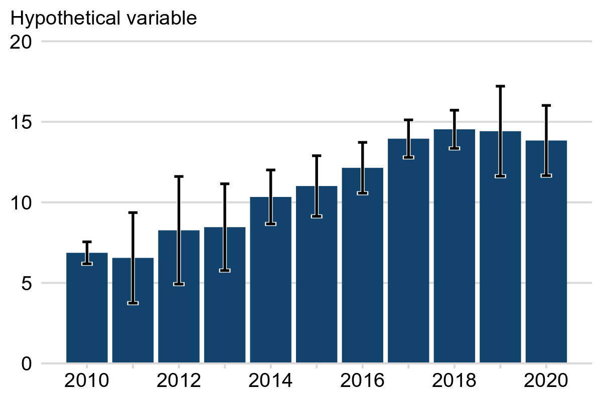
Note: the error bars represent 95% confidence intervals.
Example 4b shows an example with categorical data and horizontal bars. A hypothetical variable is shown on the x-axis and a categorical variable on the y-axis. Horizontal error bars are included to show the uncertainty in the estimate for each category. The wider the error bar the larger the uncertainty.
Example 4b: Hypothetical variable by category, England, 2024
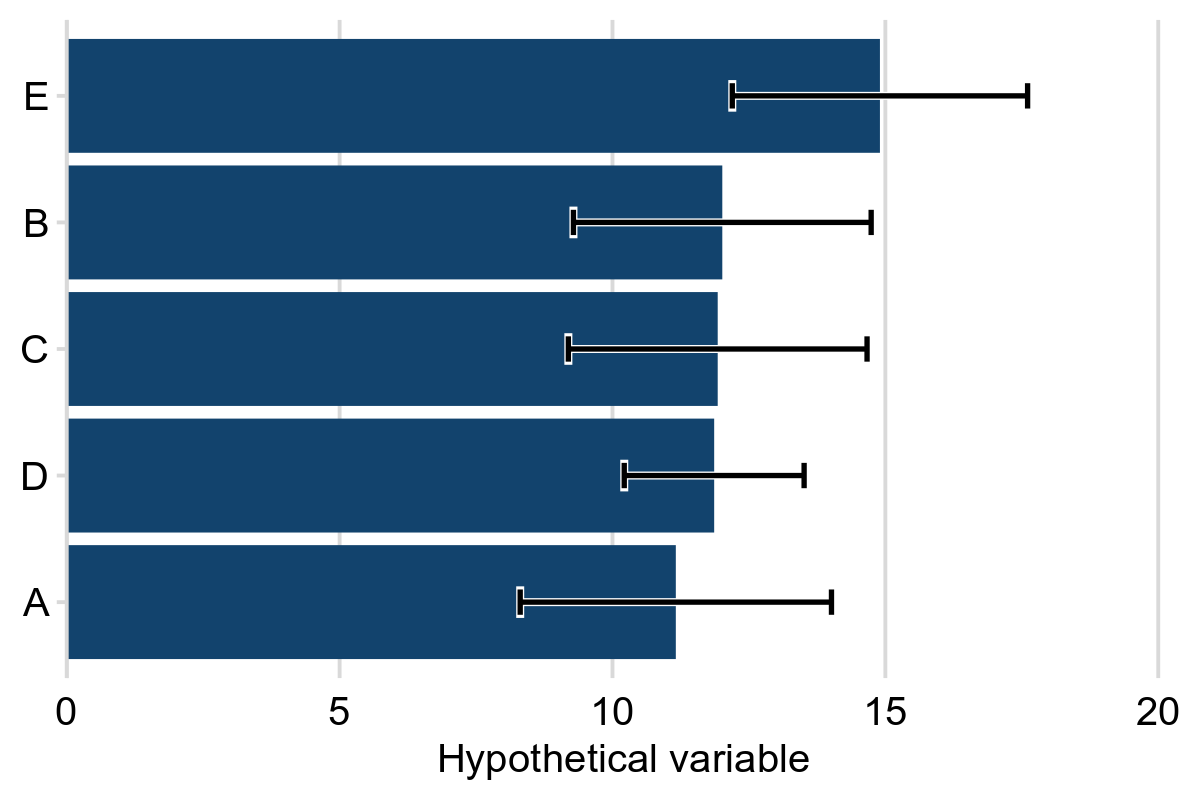
Note: the error bars represent 95% confidence intervals.
Revisions
Revisions are common in many analytical outputs that are published weekly or monthly. Revisions can occur for a variety of reasons: for example, to incorporate new data that was unavailable at the time of first release, to include improved data that is more accurate, or to correct errors.
The impact that revisions have on statistics should be quantified and clearly communicated to users. This enables users to understand the size and direction of changes resulting from revisions that are made.
The typical effect of any revision should be quantified in absolute terms in a QMI report to allow users to understand the effect revisions typically have. For example, the difference between the provisional and final values should be given in reports, either in absolute or percentage terms.
Where it is common for revisions to be made over a period of several weeks or months after first release, authors should include a statement on the typical effect this has. For example: “Historical revisions to data are possible X weeks after first release. Revisions to X typically result in a change of around 0.1%”. This information should be regularly reviewed and updated to ensure it remains accurate.
Standard wording for inclusion in reports
The expandable sections below include standard wording that authors can use to explain common measures of uncertainty to the users of their reports, for example in a glossary section.