
Creating clear and accessible data visualisations
Main messages
- Data visualisations such as graphs and charts must be compliant with current accessibility legislation.
- You should choose an appropriate and consistent way to visualise different types of data.
- Colours, text, and formatting should be carefully applied in order to aid interpretation of data visualisations.
- Data visualisations should be easy to understand for users of all backgrounds.
This page is based upon a range of sources from across government and beyond. For a reading list, please see the sources section towards the bottom of this page.
How to use this guidance
Good accessibility brings benefits to all users, improving the quality and value of our statistics, and the trust users have in us.
This guidance is intended as a practical handbook for creating charts and charts. It condenses the most relevant government resources on data visualisation together with our own experience of producing analytical outputs. While the information on this page is by no means comprehensive, we hope that it provides a useful overview of best practices and how to implement them.
R code to produce a minimal reproducible example is available under each chart. They were made using a standard ggplot2 theme which can be found inside the expandable section below. If you have any questions about our R resources or need any assistance using them, don’t hesitate to email us at UKHSA_HOPSTATS@ukhsa.gov.uk and we’ll be happy to help in any way that we can!
Choosing the right chart
Charts are particularly effective when used to highlight key points in a publication. You should choose the type of chart based on the type of data and the trend you are trying to show.
This section gives some specific recommendations for presenting categorical data or time series data in an accessible way.
Categorical data
Bar charts work well for comparing different categories.
When making a bar chart, consider whether there is a logical ordering to the bars that groups similar categories together. For example, you could order age groups from lowest to highest or place bars to adjacent geochartical regions next to each other. If there is no logical ordering, it is often most helpful to present bars in order of size.
Stacked or clustered bar charts can be used to display two different categorical variables in one chart. However, each individual stack or cluster should usually contain no more than four categories as a rule of thumb, to avoid clutter. This is especially the case for stacked bar charts, as a larger number of categories makes comparisons between bars much more difficult. If you have a large number of categories, it is usually best to split your data into several bar charts. The section “how to reduce clutter in charts” contains examples of ways to break down charts that contain too many categories, including reformatting them as small multiples charts.
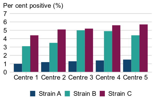
It is best practice when making clustered bar charts to leave a small gap between each bar in a cluster to help users distinguish more easily between bars. A wider gap should be left between clusters, again to help users easily distinguish different clusters.
❌ To be avoided: no space within clusters
Example 1: Percentage of positive tests for three disease strains at five testing centres in England, 2024
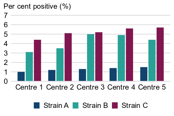
✔️ Best practice: applying spacing to clustered bar charts
Example 2: Percentage of positive tests for three disease strains at five testing centres in England, 2024
Time series data
Line charts are most often used to show time series data. They work well for showing how multiple variables change over a period of time.
If you are only showing one time series variable, a bar chart can also be used. However, stacked and clustered bar charts should not be used for displaying multiple time series variables as they make comparisons difficult.
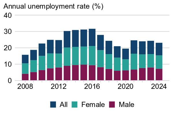
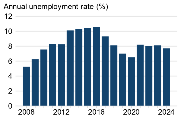
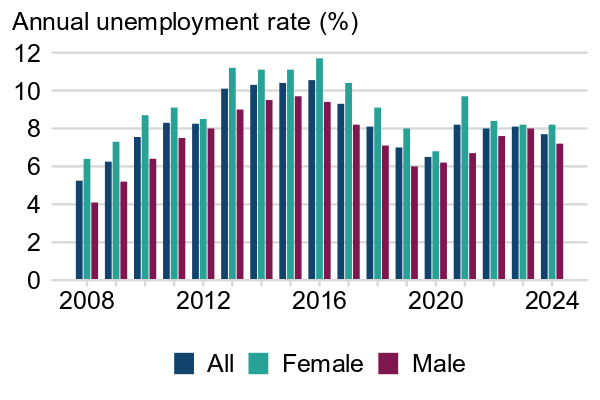
Below, the stacked bar chart on the left makes non-adjacent categories in the same bar difficult to compare: here, the “All” and “Male” categories appear the same size in many of the bars. Furthermore, it is difficult to see how categories other than the bottom one change over time. Changes in the “Male” bar are clearly displayed, but trends in the other two categories are harder to identify at a glance. (Note that stacking totals on top of individual categories is also not good practice here.) Where there is only one category, a bar chart is easy to read, as can be seen on the right.
❌ To be avoided: showing multiple categories in time series data with stacked bar charts
Example 3: Annual unemployment rates by gender, UK, 2008 to 2024
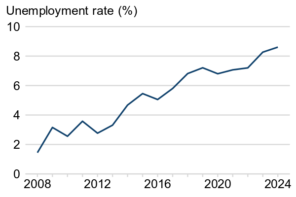
✔️ Best practice: using bar charts or line charts for time series data only when there is one category
Example 4: Annual unemployment rates for all genders, UK, 2008 to 2024
Below, the clustered bar chart on the left resolves some of the issues with comparability seen in the stacked bar chart above, but is more visually crowded as the bars become thinner and harder to focus on. Stacked and clustered bar charts are also not a good choice when you wish to display the total of all categories alongside the individual groups. The inclusion of a separate bar for “All” in the two bar charts above can incorrectly imply to users that this is a third, distinct category.
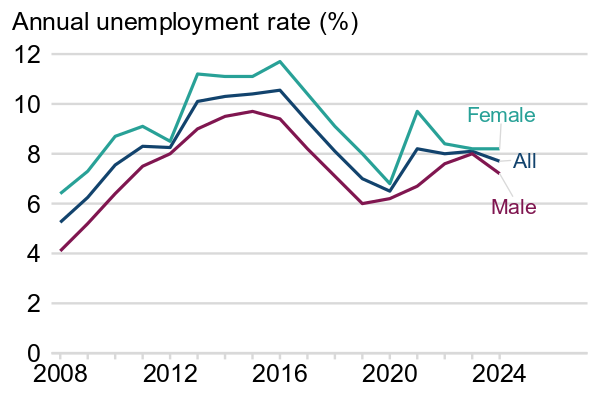
When multiple categories are involved, it is best practice to use a line chart like the one on the right. In this chart, differences between categories and time points are easy to identify. The overall trends are clearly displayed and can be understood at a glance. Note that the lines have been labelled directly rather than with a legend: this is how line charts should be labelled (see communicating without colour for more information).
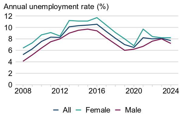
❌ To be avoided: using a clustered bar chart when there are many lines to display
Example 5: Annual unemployment rates by gender, UK, 2008 to 2024
✔️ Best practice: using a line chart to clearly show trends over time for multiple groups
Example 6: Annual unemployment rates by gender, UK, 2008 to 2024
Weekly and quarterly time series data
Some types of time series data, especially health data, are often gathered and interpreted on a weekly or quarterly basis.
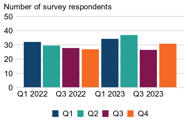
If you are using a bar chart to show quarterly data, you should not colour every bar according to quarter as this can be difficult to read.
One of the benefits of using week or quarter numbers is that it allows the same point in time to be compared across multiple years: for instance, comparing data from the most recent quarter with data from the same quarter last year. If you would like users to compare specific values in this way, this may be better achieved with plain text or a table than a chart. Government Analysis function guidance notes that “a well structured table can often be as powerful as a chart” in these situations, and that another option is to include both.
❌ To be avoided: using colours to indicate quarter number on a bar chart
Example 7: Quarterly survey respondents, England and Wales, 2022 to 2023
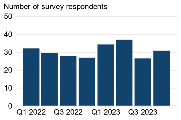
✔️ Best practice: label all quarters directly and use the same colour for each
Example 8: Quarterly survey respondents, England and Wales, 2022 to 2023
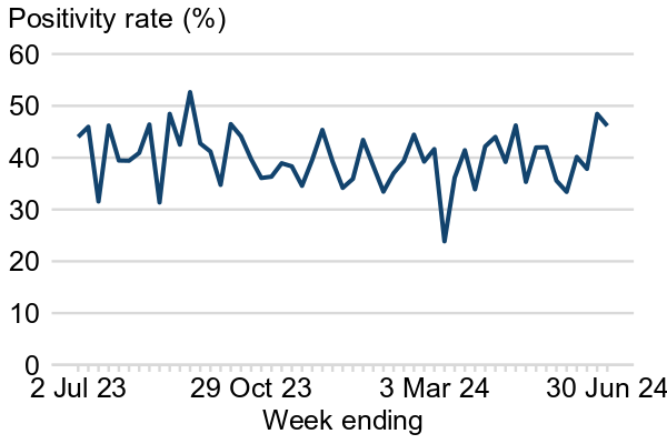
ISO weeks are a useful standardisation that allows data to be compared easily with previous years. However, many users may not be familiar with how to interpret week numbers, especially when data starts midway through a calendar year and/or covers multiple years. Therefore when displaying weekly data, it may be helpful to give a brief explanation of this measurement system, or replace the labels on your x-axis with calendar dates that correspond to the start of each week.
When showing weekly data, one option might be to include some calendar dates below the week numbers. To avoid clutter, you do not need to label every week number, but should at least label the beginning and end of the series.
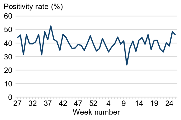
❌ To be avoided: using only week numbers to indicate time
Example 9: weekly test positivity rates, UK, past 52 weeks (no calendar dates)
✔️ Best practice: including month and year information
Example 10: weekly test positivity rates, UK, past 52 weeks (including calendar dates)
Guidance for all charts
All published charts must include the following:
- an accessible alternative such as a text description or table (either within the surrounding text or a linked spreadsheet)
- a data source referenced in the surrounding text
- an appropriately tagged title (including figure number)
- axis and series labels
See inside the expandable sections below for more information.
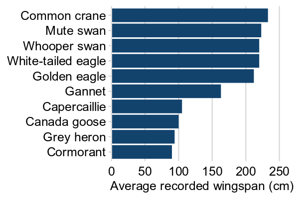
Ranking
Bar charts are a good option to show data ranked in ascending or descending order. Always rank bars by value, unless there is a natural order, for example, age or time.
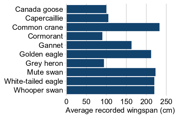
❌ To be avoided: showing un-ranked bars in a bar
Example 11: top 10 average recorded wingspan of British birds
✔️ Best practice: show bars ranked in ascending or descending order
Example 12: top 10 average recorded wingspan of British birds, ranked
Breaking the axis
“Breaking” an axis occurs when part of a continuous axis is left out. Rather than starting at 0, the axis may begin at a higher value, or it may begin at 0 but exclude a range of values that contain no data points.
This can be a useful way to compare categories that have very small differences between them. However, it is best practice in bar charts to avoid this for the y-axis. This is because the bars in a bar chart are intended to be proportional representations of the different categories.
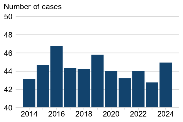
❌ To be avoided: breaking the y-axis when using a bar chart
Example 13: Number of cases, UK, 2014 to 2024
✔️ Best practice: start the y-axis at zero in bar charts
Example 14: Number of cases, UK, 2014 to 2024
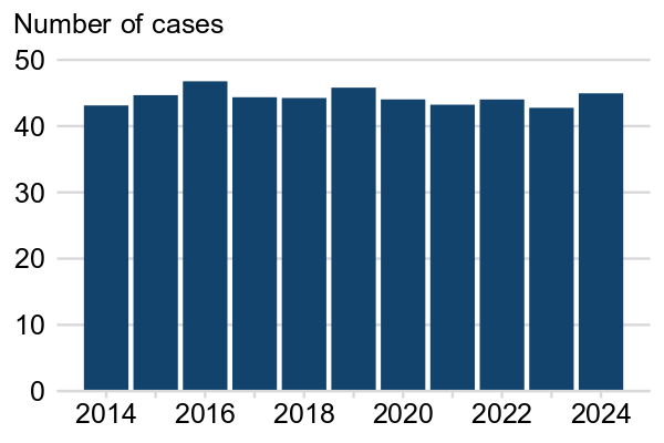
Above, the bar chart on the left shows an example of a misleading break in the y-axis. In the bar chart on the right, best practice has been followed for formatting a y-axis that starts at 0.
If you need to break the y-axis, you should use a line chart, dot plot, or other alternative chart and indicate the break clearly on the chart by:
- making the break in the y-axis clear using a broken axis symbol (two parallel lines striking diagonally through the axis)
- making the x-axis line the same colour and thickness as the gridlines
- making the y-axis and the axis break symbol thicker and darker than the gridlines and x-axis
Axis breaks should only be used to show that the y-axis does not start at zero. Where you would like to display data points that contain an outlier, you should never break the axis halfway through.
Chart colours and text
The colours and formatting of a chart can make a significant difference in its legibility. To ensure your chart can be read and understood by as many people as possible, it is best practice to:
- use a suitable and accessible colour palette
- ensure that you do not rely on colour alone to communicate information
- use white for the background
- use light grey for gridlines
- avoid any images, patterns, or shading
- use black or dark grey text in a sans serif font
- avoid slanted or vertical text
- ensure that text is large enough to be read easily
Using a suitable and accessible colour palette
It is an accessibility requirement that visual elements such as charts use colours that have a contrast ratio of at least 3:1 with their backgrounds. The WebAim site contains more information on this requirement and has a contrast checker you can use to make sure that your colours are appropriate.
It is best to:
- not rely on colour alone to communicate information (directly label line charts or use a legend in the same order as categories in bar charts)
- avoid using a palette of more than 4 colours; do not use palettes of more than 6 colours (split charts up instead)
- for ordinal categories (such as age), use single-hue palettes (for example, different shades of blue) but ensure all colours have a good contrast with a white background
- not use single-hue palettes for non-ordinal categories (use different colours instead)
- use the Analysis Function colour palette
Communicating without colour
It is an accessibility requirement that charts do not rely on colour alone to communicate. This means that charts should be just as easy to understand if they are displayed in greyscale as they are in full colour.
Example 15 below relies entirely on colour to communicate which line represents which category, presenting an accessibility issue. There is a particular issue here because the legend is not in the same order as the lines on the chart, which could be misleading. Example 16 instead has each line labelled directly in accordance with best practice accessibility standards.
It is possible to use different data marker shapes or textured lines such as dotted or dashed lines to distinguish between variables on a line chart. However, these also increase clutter and caution is advised in using them.
❌ To be avoided: relying on colour alone to distinguish categories
Example 15: Annual unemployment rates by gender, UK, 2008 to 2024
✔️ Best practice: labelling the categories directly
Example 16: Annual unemployment rates by gender, UK, 2008 to 2024

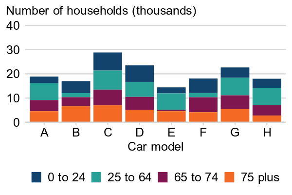
You should not use patterns on chart bars to distinguish different categories as these can make charts very hard to read, especially at smaller sizes. Instead, stacked and clustered bar charts can include direct labels, or you can include a legend in the same order as the categories and add a note that you have done so.
❌ To be avoided: using patterns to distinguish categories on a bar chart
Example 17: Number of buyers of eight car models by age, UK, 2024
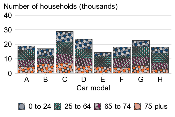
✔️ Best practice: using a legend in the same order as the categories
Example 18: Number of buyers of eight car models by age, UK, 2024
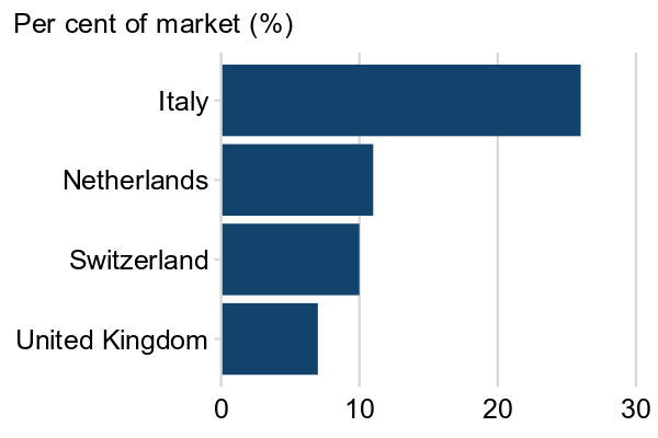
Text orientation
If your labels are too long to fit horizontally on the bottom of the chart, you should not tilt them diagonally or vertically to fit as this can be hard to read. For bar charts showing categorical data, a horizontal bar chart is often a good solution as it allows plenty of space for labels. When showing time series data, you do not need to include a label for every time point if there is not space.
❌ To be avoided: vertical text labels
Example 19: Market shares of four largest importers for a product, USA, 2024
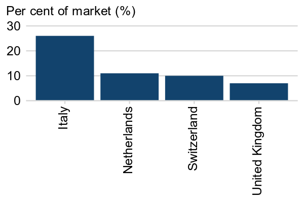
✔️ Best practice: rotate chart (categorical data)
Example 20: Market shares of four largest importers for a product, USA, 2024
Slanted text can pose a particular accessibility barrier for some users with visual impairments. It is therefore best to keep all text horizontal, including y-axis labels.
❌ To be avoided: slanted text labels
Example 21: Annual unemployment rate for females, UK, 2008 to 2024
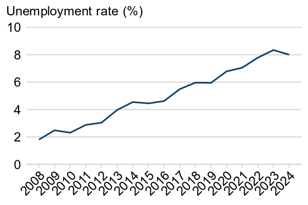
✔️ Best practice: omit some labels and rotate text
Example 22: Annual unemployment rate for females, UK, 2008 to 2024
Consistency
A publication is easier for users to understand when all charts take a consistent approach to data visualisation. Following these steps will allow readers to spend less time trying to understand how to go about interpreting each chart and more time focusing on what the intended message is. Accordingly:
- when variables appear in multiple charts, they should be the same colour in each chart
- style elements such as line weight and font size should be the same in all charts
- units, labels, and titles should follow the same format for each chart, where applicable
- similar types of data should be presented using the same type of data visualisation wherever possible
Clarity
In general, the GOV.UK standard is to use simple language and avoid unnecessary complexity. In fact, it has been shown that even users with a high degree of specialist understanding appreciate simple writing that allows them to process information as quickly as possible (see the writing for GOV.UK guidance).
Of course, it is often necessary to write about specialist topics in a way that requires more difficult language. Any technical or specialist elements on your chart should be explained in some way. It is important to consider your users and their understanding of the subject matter to decide how much explanation is needed.
Even if you believe that a publication will primarily be of interest to specialists, releasing it to the public means that it is available to users from a wide range of backgrounds. Even users who are not experts in the subject matter should still be able to understand the main points of your data visualisations. You should explain:
- representations of uncertainty, such as confidence intervals and p-values
- technical language and potentially unfamiliar abbreviations and units of measurement
How to reduce clutter in charts
It can be tempting to try to fit as much information as possible onto one set of axes. However, a very busy chart risks telling the wrong story to your users or confusing them. A helpful rule of thumb is “If you cannot write down the message your chart is giving in a few sentences, you should think again about the chart you have chosen.”
Best practice for avoiding chart clutter includes:
- using only one set of axes on a chart
- minimising the number of colours and other potential distractions
- including a maximum of four categories in line charts, clustered bar charts, and stacked line charts
One chart, one set of axes
Charts should only have one x-axis and one y-axis.
Using two different scales of measurement on one chart can easily over-emphasise or mask the relationship between variables and can make your chart cluttered. The Government Analysis Function have provided a useful demonstration of this risk, showing how dual y-axes can be manipulated to show almost any relationship between two variables (see the “manipulation example” section here).
Similarly, it is usually best to use only one type of chart on each set of axes. If you wish to show how two variables with different scales or units of measurement change in tandem with each other, a good option is simply to put them on two side-by-side or stacked charts.
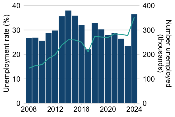
❌ To be avoided: two sets of axes on a chart
Example 23: Annual unemployment rate and number unemployed, UK, 2008 to 2024
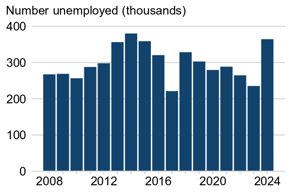
✔️ Best practice: side by side charts
Example 24a: Number unemployed in the UK, 2005 to 2021
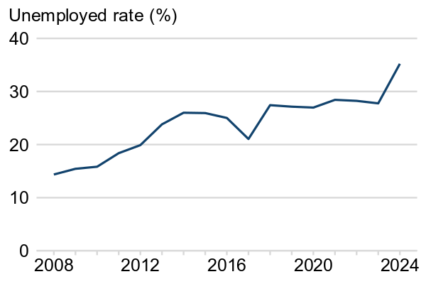
✔️ Best practice: side by side charts
Example 24b: Annual unemployment rate in the UK, 2005 to 2021
Minimising colours and distractions
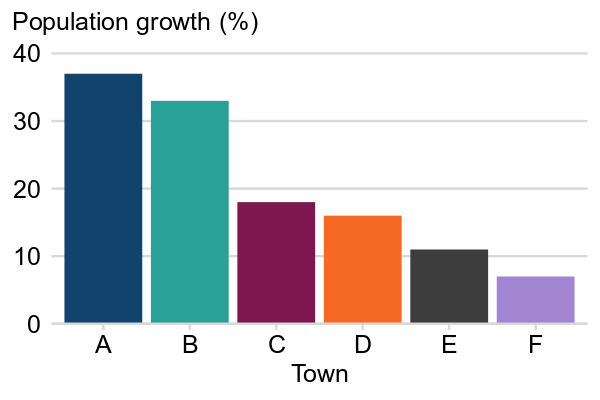
Shading, borders, textures, and unnecessary embellishments should be avoided. Bar charts do not need to have borders around each bar and patterns should not be used to distinguish between bars. Bar charts which are not stacked or clustered should not have bars in different colours as this does not aid in chart interpretation but can be visually distracting.
❌ To be avoided: different colours for each bar
Example 25: Population growth of different towns, South West England, 2000 to 2020
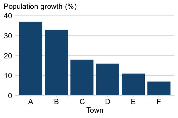
✔️ Best practice: only use different colours if absolutely necessary
Example 26: Population growth of different towns, South West England, 2000 to 2020
Limiting the number of categories
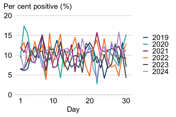
If multiple variables or categories of a single variable are measured on the same scale, a chart can be a useful way of comparing between them. However, as the number of variables on a single chart increases, charts can easily become cluttered and hard to read. Presenting more than four lines on a line chart can be done, but it often results in the chart becoming too cluttered, so we advise that charts should not contain more than four categories unless there is a clear statistical justification. This is best practice for all types of charts, including line charts, stacked bar charts, and clustered bar charts.
❌ To be avoided: crowded line charts with more than four different lines
Example 27: Daily test positivity rates in June for an infectious disease, UK, 2019 to 2024
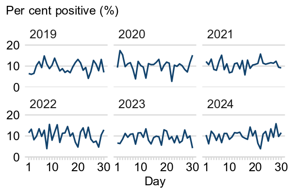
✔️ Best practice: using a small multiples chart
Example 28: Daily test positivity rates in June for an infectious disease, UK, 2019 to 2024
Focus charts
Where you would like to call attention to one category, for instance when you are comparing data from the current year to data from previous years, you can use a “focus chart” where one line is a different colour to the rest. In this case, you can include more than four lines on your chart, but they should be noticeably lighter than the “focus” line, for instance a light grey, and still should be labelled.
✔️ Best practice: using a focus chart to call attention to one category
Example 29: Daily test positivity rates in June for an infectious disease, UK, 2019 to 2024
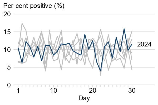
The chart above shows a good way to highlight the most recent year in a multi-year time series. However, with an increasing number of lines, there will be more overlap and so it will become harder to distinguish the individual lines in grey. There is no fixed maximum number of lines in a focus chart, but you should make sure that the main message of the chart is still easily communicated.
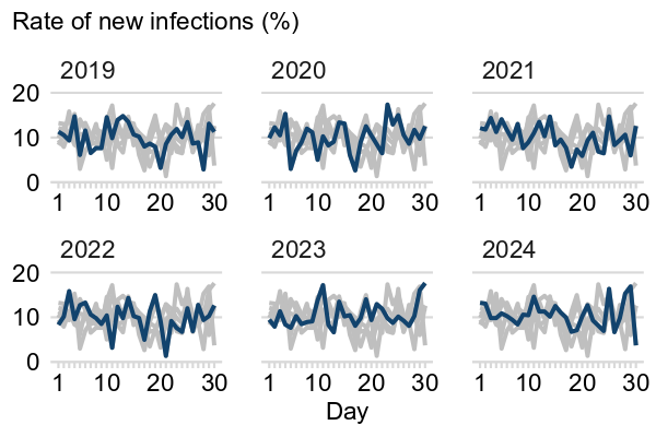
Alternatively, you can combine small multiples and focus charts into one, showing the focal category in one colour and the other categories in a different colour.
✔️ Best practice: combing small multiples and focus charts to call attention to one category
Example 30: Rate of new infections, UK, 2018 to 2024
Maps and geography standards
The Analysis Function have produced a ‘How To Make A Good Map’ e-learning course which introduces the most common types of maps used to present statistics, and provides guidance on what to think about when making a statistical map.
The Office for National Statistics have also produced guidance to provide the recommended presentation order for standard geographies. This is so that Official Statistics are geographically comparable, consistent and fit for purpose.
Sources
- Government Analysis Function: data visualisation: charts
- Government Analysis Function: data visualisation: tables
- Government Analysis Function: data visualisation: colours
- Government Analysis Function: Making charts accessible – material, links and answers to questions from dataConnect22 session
- Government Digital Service: Content design: planning, writing and managing content
- The Office for National Statistics: Service Manual: Data visualisation
- The Office for Statistics Regulation: Approaches to presenting uncertainty in the statistical system