Introduction
Epi curves are fundamental tools in epidemiological surveillance and
outbreak investigation. They display the distribution of cases over
time, helping identify the source, transmission patterns, and
progression of disease outbreaks. The epi_curve() function
supports various time periods, grouping options, rolling averages,
cumulative lines, and both static and interactive visualizations.
Example 1: Basic epi curve with rolling average
Basic epi curves with rolling averages help smooth out daily fluctuations and identify underlying trends in surveillance data.
Create the basic epi curve
epi_curve(
  dynamic = FALSE,  # Create static ggplot chart
  params = list(
    df = epiviz::lab_data,
    date_var = "specimen_date",     # Date variable in the dataset
    date_start = "2020-01-01",      # Start date for the curve
    date_end = "2023-12-31",        # End date for the curve
    time_period = "year_month",     # Monthly aggregation
    fill_colours = "#007C91",       # Color for bars
    # Rolling average parameters
    rolling_average_line = TRUE,                    # Include rolling average line
    rolling_average_line_lookback = 3,             # 3-month rolling average
    rolling_average_line_legend_label = "3-month rolling average",  # Legend label
    chart_title = "Laboratory Detections per Month",
    x_axis_title = "Year - Month",
    y_axis_title = "Number of detections",
    x_axis_label_angle = -90
  )
)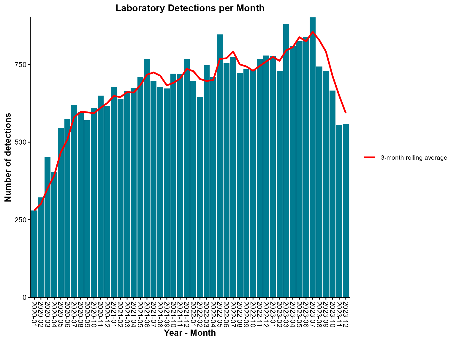
Monthly epi curve with a three-month rolling average.
Interpretation: This epi curve shows monthly detections with a 3-month rolling average line that smooths out month-to-month variations to reveal underlying trends.
Example 2: Grouped epi curve with stacked bars
Grouped epi curves allow comparison of different categories (e.g., organism types) over time, showing both individual patterns and overall trends.
Create the grouped epi curve
# Define custom week breaks for better x-axis display
week_seq <- seq(as.Date("2021-01-01"), as.Date("2022-05-31"), by = '2 week')
week_breaks <- paste0(lubridate::isoyear(week_seq), '-W', lubridate::isoweek(week_seq))

epi_curve(
  dynamic = FALSE,  # Create static ggplot chart
  params = list(
    df = epiviz::lab_data,
    date_var = "specimen_date",
    date_start = "2021-01-01",
    date_end = "2022-05-31",
    time_period = "iso_year_week",  # Weekly aggregation using ISO weeks
    group_var = "organism_species_name",  # Group by organism type
    group_var_barmode = "stack",    # Stack bars to show total and composition
    fill_colours = c("KLEBSIELLA PNEUMONIAE" = "#007C91",
                     "STAPHYLOCOCCUS AUREUS" = "#8A1B61",
                     "PSEUDOMONAS AERUGINOSA" = "#FF7F32"),  # Named color mapping
    rolling_average_line = TRUE,
    rolling_average_line_legend_label = "7-week rolling average",
    chart_title = "Laboratory detections by species \n 2021-01 - 2022-05",
    chart_footer = "This chart has been created using simulated data.",
    x_axis_title = "Year - ISO Week",
    y_axis_title = "Number of detections",
    x_axis_label_angle = -90,
    x_axis_break_labels = week_breaks,  # Custom week labels
    y_axis_break_labels = seq(0, 250, 20),  # Custom y-axis breaks
    chart_title_colour = "#007C91",
    chart_footer_colour = "#007C91"
  )
)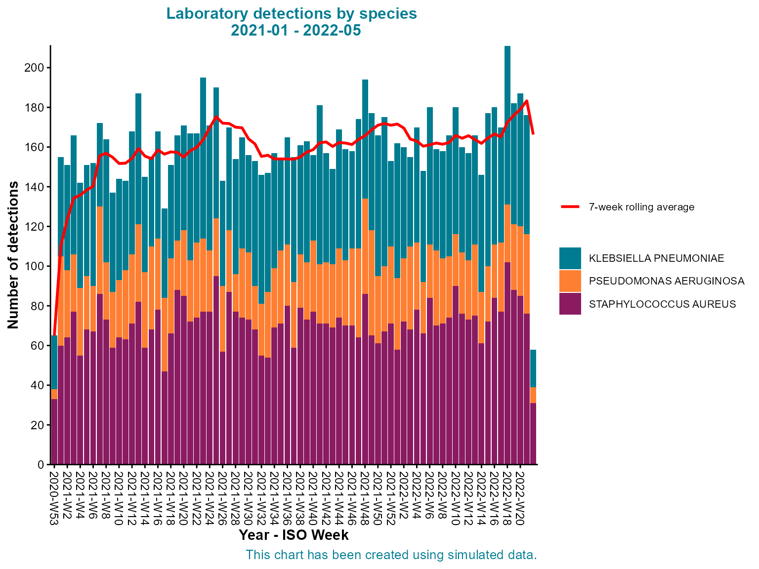
Stacked weekly epi curve by organism species with seven-week rolling average.
Interpretation: This stacked epi curve shows both the total weekly detections and the relative contribution of each organism type, revealing patterns in the overall burden and individual organism trends.
Example 3: Daily epi curve with case boxes and cumulative line
Daily epi curves with case boxes and cumulative lines are essential for outbreak investigation, providing detailed temporal resolution and cumulative case tracking.
Create the detailed daily epi curve
epi_curve(
  dynamic = FALSE,  # Create static ggplot chart
  params = list(
    df = epiviz::lab_data,
    date_var = "specimen_date",
    date_start = "2021-06-01",
    date_end = "2021-07-31",
    time_period = "day",            # Daily aggregation for detailed analysis
    group_var = "organism_species_name",
    group_var_barmode = "stack",
    fill_colours = c("#007C91", "#8A1B61", "#FF7F32"),
    # Advanced features
    case_boxes = TRUE,              # Enable case boxes
    rolling_average_line = TRUE,
    rolling_average_line_legend_label = "7-day rolling average",
    cumulative_sum_line = TRUE,     # Add cumulative line
    # Threshold line
    hline = c(35),                  # Threshold value
    hline_label = "Threshold",
    hline_width = 0.5,
    hline_colour = "orange",
    hline_label_colour = "orange",
    hline_type = "dotdash",
    # Styling
    chart_title = "Laboratory detections by species \n June - July 2021",
    chart_title_colour = "#007C91",
    legend_title = "Detected organisms",
    legend_pos = "right",
    y_limit_max = 40,               # Set y-axis maximum
    x_axis_break_labels = as.character(seq(as.Date("2021-06-01"),
                                           as.Date("2021-07-31"),
                                           by = '2 days')),  # Every 2 days
    y_axis_break_labels = seq(0, 40, 5),  # Every 5 units
    x_axis_title = "Date",
    y_axis_title = "Number of detections",
    x_axis_label_angle = -90,
    y_axis_label_angle = 90
  )
)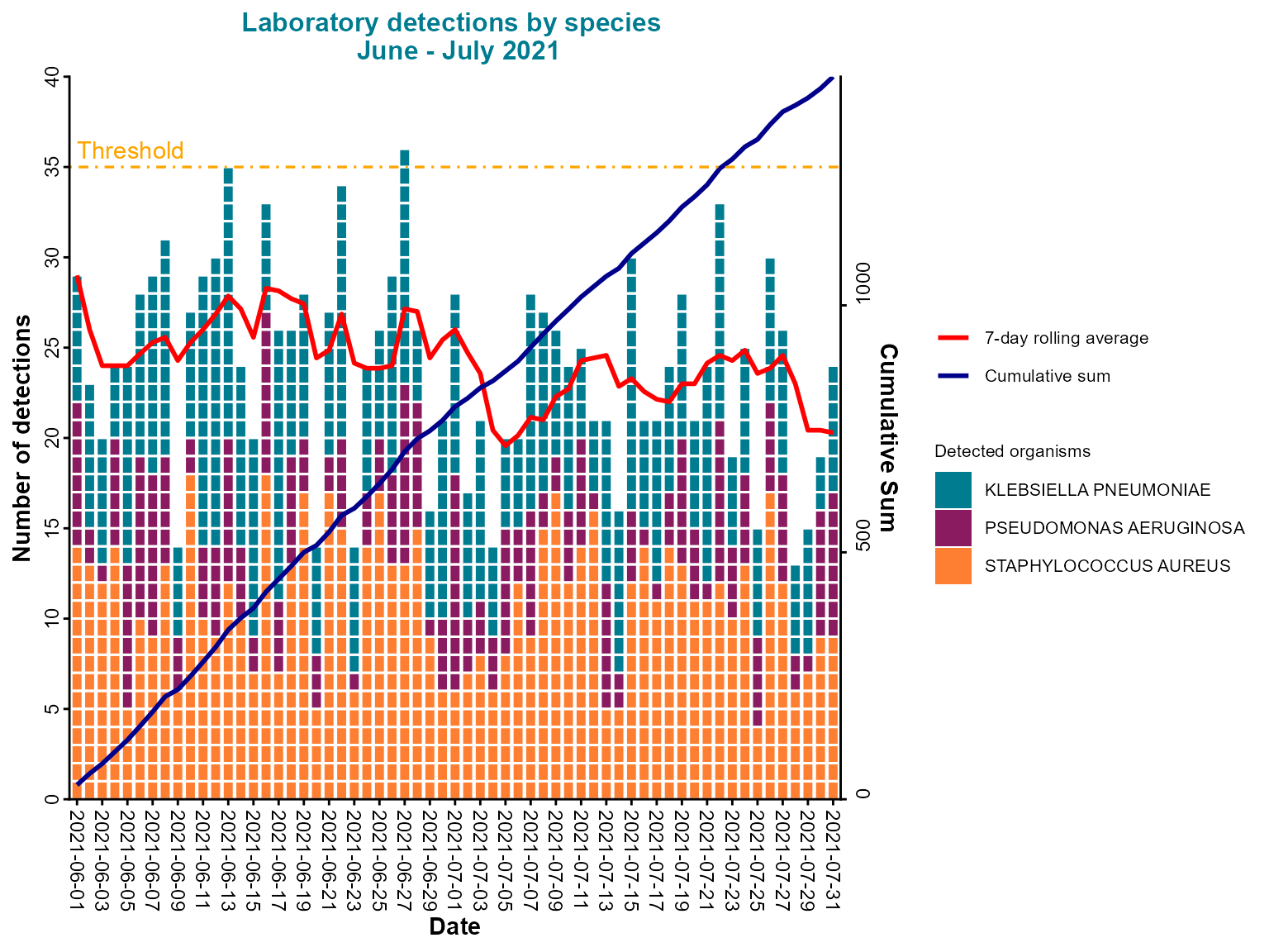
Daily epi curve with stacked bars, case boxes, cumulative line, and threshold indicator.
Interpretation: This comprehensive daily epi curve includes case boxes for highlighting specific data points, a rolling average for trend identification, a cumulative line for total case tracking, and a threshold line for alert levels.
Example 4: Pre-aggregated data with rolling and cumulative lines
When working with pre-aggregated data, you can still add rolling averages and cumulative lines for trend analysis.
Create the pre-aggregated epi curve
epi_curve(
  dynamic = FALSE,  # Create static ggplot chart
  params = list(
    df = pre_agg_data,
    y = "detections",               # Specify the count column
    date_var = "specimen_date",
    date_start = "2021-10-01",
    date_end = "2022-03-31",
    time_period = "iso_year_week",  # Weekly aggregation
    # Rolling and cumulative lines
    rolling_average_line = TRUE,
    rolling_average_line_lookback = 3,
    rolling_average_line_legend_label = "3-week rolling average",
    rolling_average_line_colour = "#007C91",
    rolling_average_line_width = 1.5,
    cumulative_sum_line = TRUE,     # Add cumulative line
    cumulative_sum_line_colour = "orange",
    chart_title = "Laboratory Detections by Region \nWinter 2021-22",
    chart_title_colour = "#007C91",
    legend_pos = "right",
    y_axis_break_labels = seq(0, 300, 50),
    x_axis_title = "ISO Week",
    y_axis_title = "Number of detections",
    x_axis_label_angle = -90,
    hover_labels = "<b>Week:</b> %{x}<br><b>Count:</b> %{y}"  # Custom hover text
  )
)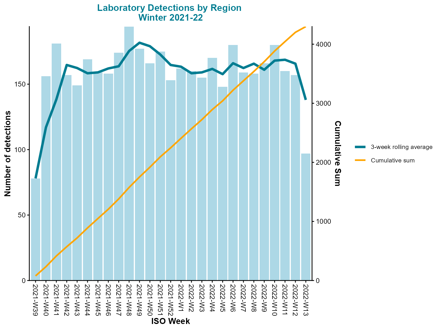
Weekly epi curve from pre-aggregated counts with rolling average and cumulative total.
Interpretation: This epi curve uses pre-aggregated data with both rolling average and cumulative lines, providing multiple perspectives on the temporal trends in detections.
Example 5: Interactive grouped epi curve
Interactive epi curves are ideal for surveillance dashboards, allowing users to explore data dynamically, zoom into specific time periods, and hover for detailed information.
Create the interactive grouped epi curve
epi_curve(
  dynamic = TRUE,   # Create interactive plotly chart
  params = list(
    df = epiviz::lab_data,
    date_var = "specimen_date",
    date_start = "2021-01-01",
    date_end = "2022-05-31",
    time_period = "iso_year_week",
    group_var = "organism_species_name",
    group_var_barmode = "stack",
    fill_colours = c("KLEBSIELLA PNEUMONIAE" = "#007C91",
                     "STAPHYLOCOCCUS AUREUS" = "#8A1B61",
                     "PSEUDOMONAS AERUGINOSA" = "#FF7F32"),
    rolling_average_line = TRUE,
    rolling_average_line_legend_label = "7-week rolling average",
    chart_title = "Laboratory detections by species \n 2021-01 - 2022-05",
    chart_footer = "This chart has been created using simulated data.",
    x_axis_title = "Year - ISO Week",
    y_axis_title = "Number of detections",
    x_axis_label_angle = -90,
    x_axis_break_labels = week_breaks,
    y_axis_break_labels = seq(0, 250, 20),
    chart_title_colour = "#007C91",
    chart_footer_colour = "#007C91"
  )
)
Interactive stacked epi curve with weekly aggregation and rolling average.
Interpretation: The interactive epi curve allows detailed exploration of weekly patterns, with hover information showing exact values and the ability to zoom into specific time periods for closer analysis.
Tips for epi curves
-
Time period selection: Choose the appropriate time period based on your analysis needs:
-
"day"for outbreak investigation -
"iso_year_week"for weekly surveillance -
"year_month"for monthly trends -
"year"for annual comparisons
-
-
Rolling averages: Use rolling averages to smooth out fluctuations and identify underlying trends:
-
rolling_average_line_lookbackcontrols the window size - Customize colors and line styles for better visibility
-
Cumulative lines: Add
cumulative_sum_line = TRUEto track total cases over time, useful for outbreak progression analysis.Case boxes: Enable
case_boxes = TRUEfor interactive charts to highlight specific data points of interest.Threshold lines: Use
hlineparameters to add horizontal reference lines for alert levels or outbreak thresholds.Pre-aggregated data: When using pre-aggregated data, specify the
yparameter to indicate which column contains the counts.Custom breaks: Use
x_axis_break_labelsandy_axis_break_labelsto control axis tick marks for better readability.Color mapping: Use named color vectors for grouped data to ensure consistent colors across charts.
Interactive features: Set
dynamic = TRUEfor interactive charts with zooming, hovering, and filtering capabilities.Chart styling: Use
chart_title_colourandchart_footer_colourto customize text colors and maintain visual consistency.Hover labels: Customize
hover_labelsfor interactive charts to show specific information when hovering over data points.Axis limits: Use
y_limit_maxto set maximum y-axis values for better focus on relevant data ranges.