Introduction
Line charts are essential for visualising temporal trends in
epidemiological data, showing how disease occurrence changes over time.
They are particularly valuable for identifying seasonal patterns,
outbreak progression, and long-term surveillance trends. The
line_chart() function supports both single and multiple
time series with extensive customisation options for colors, line
styles, and interactive features.
Example 1: Single time series without grouping
Single time series line charts are ideal for tracking overall trends in disease occurrence over time. This example shows daily detections of a specific organism.
Prepare the data
# Filter and aggregate data for a single organism (as used in tests)
single_series_data <- epiviz::lab_data %>%
  filter(
    organism_species_name == "KLEBSIELLA PNEUMONIAE",
    specimen_date >= as.Date("2023-01-01"),
    specimen_date <= as.Date("2023-01-31")
  ) %>%
  group_by(specimen_date) %>%
  summarise(count = n(), .groups = 'drop') %>%
  as.data.frame()  # Ensure it's a data frame
Create the single time series line chart
line_chart(
  dynamic = FALSE,  # Create static ggplot chart
  params = list(
    df = single_series_data,        # Note: use 'dfr' parameter (as in tests)
    x = "specimen_date",             # Date variable for x-axis
    y = "count",                     # Count variable for y-axis
    line_colour = c("blue"),         # Single color for single line
    line_type = c("solid")           # Line type
  )
)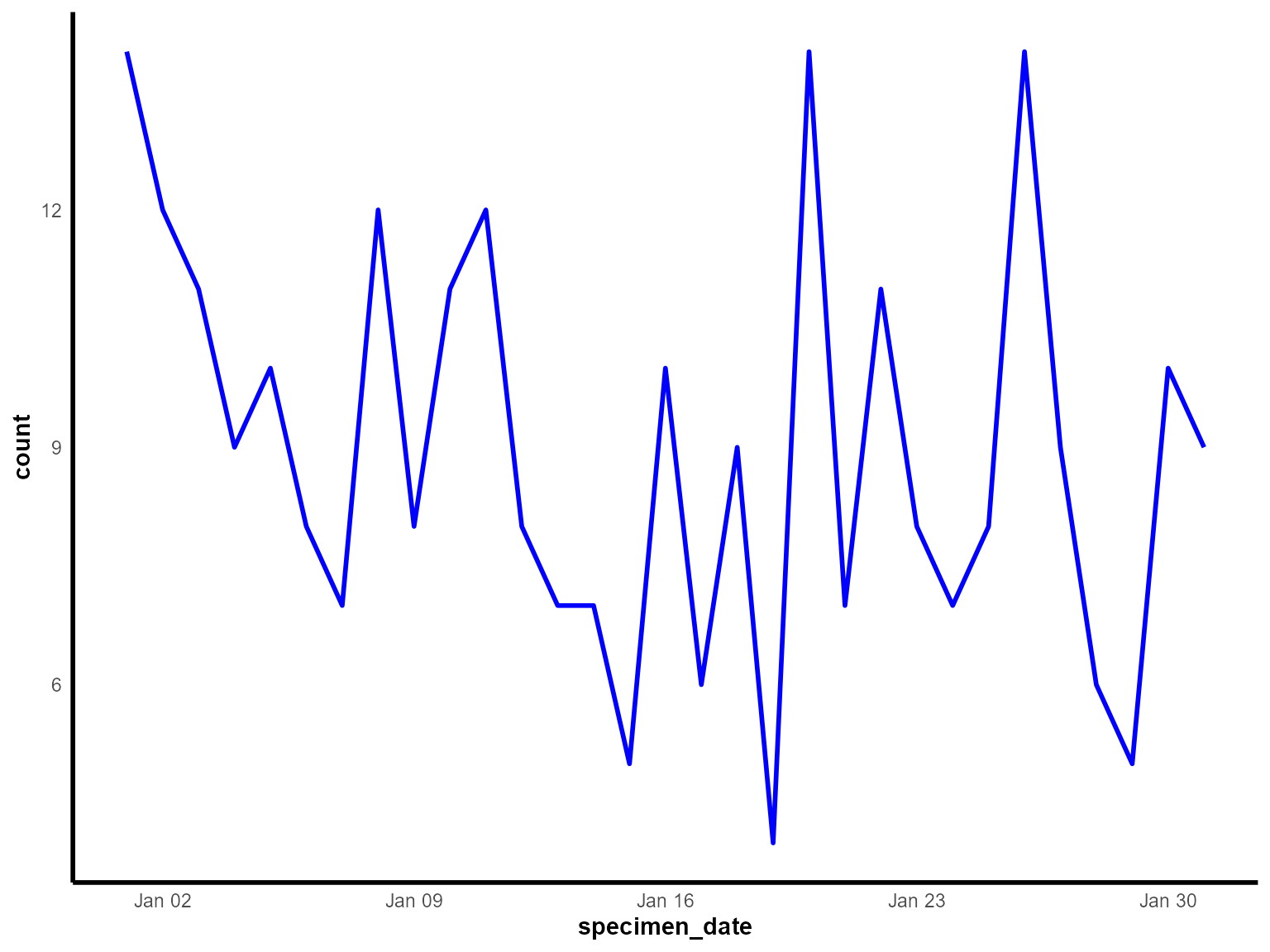
Daily detections of Klebsiella pneumoniae in January 2023.
Interpretation: This line chart shows the daily progression of Klebsiella pneumoniae detections during January 2023, revealing day-to-day variations and overall trends.
Example 2: Multiple time series with grouping
Multiple time series allow comparison of trends across different categories, such as organism types. This example compares detections of different organisms over time.
Prepare the grouped data
# Aggregate data for multiple organisms (as used in tests)
multi_series_data <- epiviz::lab_data %>%
  group_by(organism_species_name, specimen_date) %>%
  summarise(count = n(), .groups = 'drop') %>%
  ungroup() %>%
  filter(
    specimen_date >= as.Date("2023-12-01"),
    specimen_date <= as.Date("2023-12-31")
  ) %>%
  as.data.frame()  # Ensure it's a data frame
Create the multiple time series line chart
line_chart(
  dynamic = FALSE,  # Create static ggplot chart
  params = list(
    df = multi_series_data,         # Use 'df' parameter
    x = "specimen_date",             # Date variable for x-axis
    y = "count",                     # Count variable for y-axis
    group_var = "organism_species_name",  # Group by organism type
    line_colour = c("blue", "green", "orange"),  # Colors for each organism
    line_type = c("solid", "dotted", "dashed")   # Different line styles
  )
)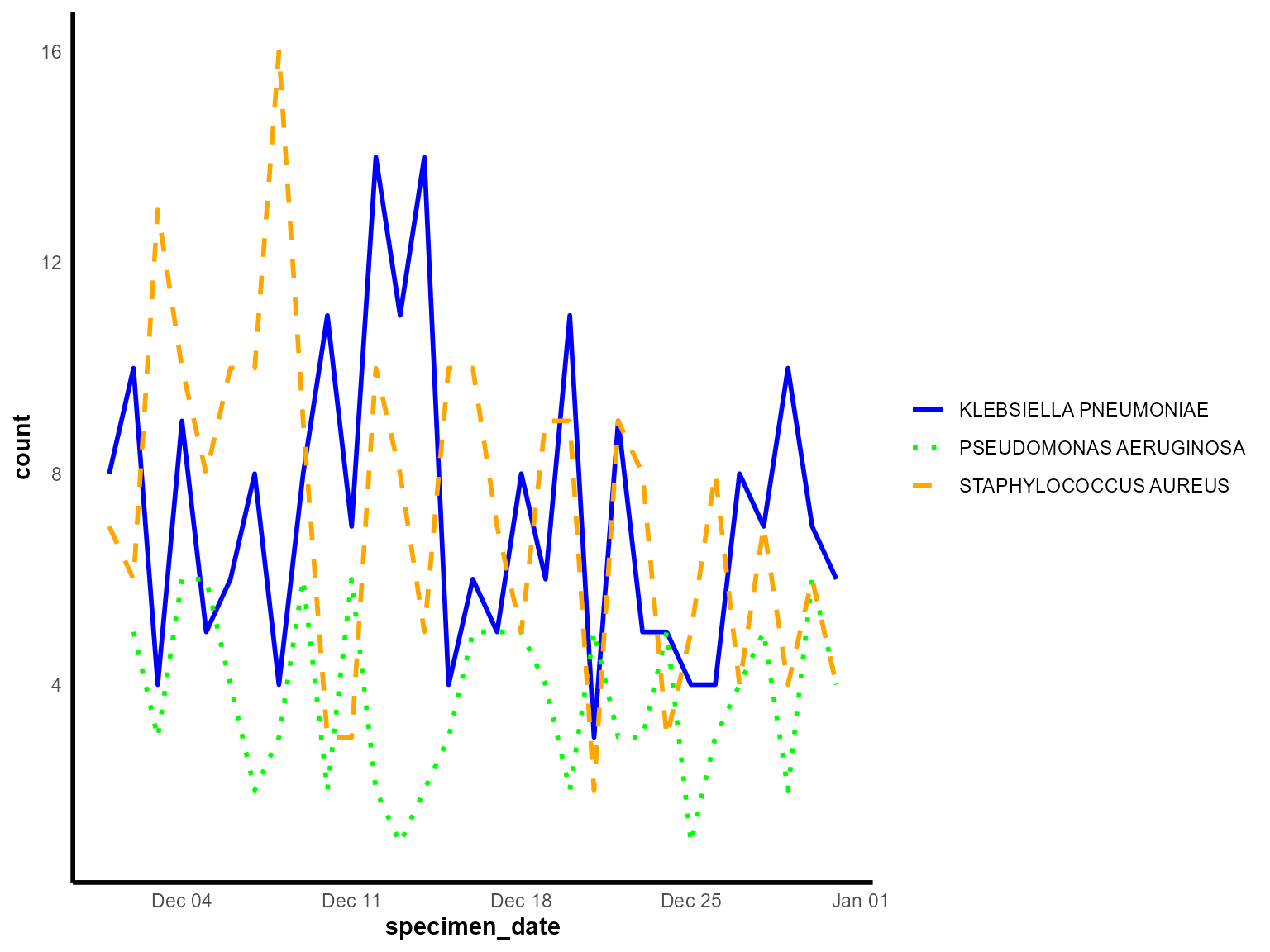
Daily detections by organism species across the month of December 2023.
Interpretation: This multiple time series chart allows direct comparison of trends between different organisms, revealing whether they follow similar seasonal patterns or have distinct temporal behaviors.
Example 3: Interactive multiple time series
Interactive line charts are ideal for surveillance dashboards, allowing users to explore data dynamically, zoom into specific time periods, and hover for detailed information.
Create the interactive line chart
line_chart(
  dynamic = TRUE,   # Create interactive plotly chart
  params = list(
    df = multi_series_data,         # Use 'df' parameter
    x = "specimen_date",             # Date variable for x-axis
    y = "count",                     # Count variable for y-axis
    group_var = "organism_species_name",  # Group by organism type
    line_colour = c("blue", "green", "orange"),  # Colors for each organism
    line_type = c("solid", "dotted", "dashed")   # Different line styles
  )
)
Interactive comparison of organism-specific detections across December 2023.
Interpretation: The interactive line chart allows detailed exploration of temporal patterns, with hover information showing exact values and the ability to zoom into specific time periods for closer analysis.
Example 4: Custom styled line chart with enhanced formatting
Enhanced line charts with custom styling are useful for creating publication-ready visualisations with specific formatting requirements.
Prepare data for enhanced styling
# Create a focused dataset for enhanced styling
enhanced_data <- epiviz::lab_data %>%
  filter(
    organism_species_name == "STAPHYLOCOCCUS AUREUS",
    specimen_date >= as.Date("2023-06-01"),
    specimen_date <= as.Date("2023-08-31")
  ) %>%
  mutate(
    specimen_week = floor_date(specimen_date, "week", week_start = 1)  # Monday start
  ) %>%
  count(specimen_week, name = "detections")
Create the enhanced line chart
line_chart(
  dynamic = FALSE,  # Create static ggplot chart
  params = list(
    dfr = enhanced_data,             # Use 'dfr' parameter
    x = "specimen_week",             # Weekly date variable
    y = "detections",                # Count variable
    line_colour = c("#FF7F32"),      # Orange color
    line_type = c("solid"),          # Solid line
    # Additional styling parameters (if supported by the function)
    chart_title = "Weekly Staph aureus detections (Summer 2023)",
    x_axis_title = "Week",
    y_axis_title = "Number of detections",
    x_axis_label_angle = -45,
    show_gridlines = TRUE,
    y_axis_limits = c(0, NA)
  )
)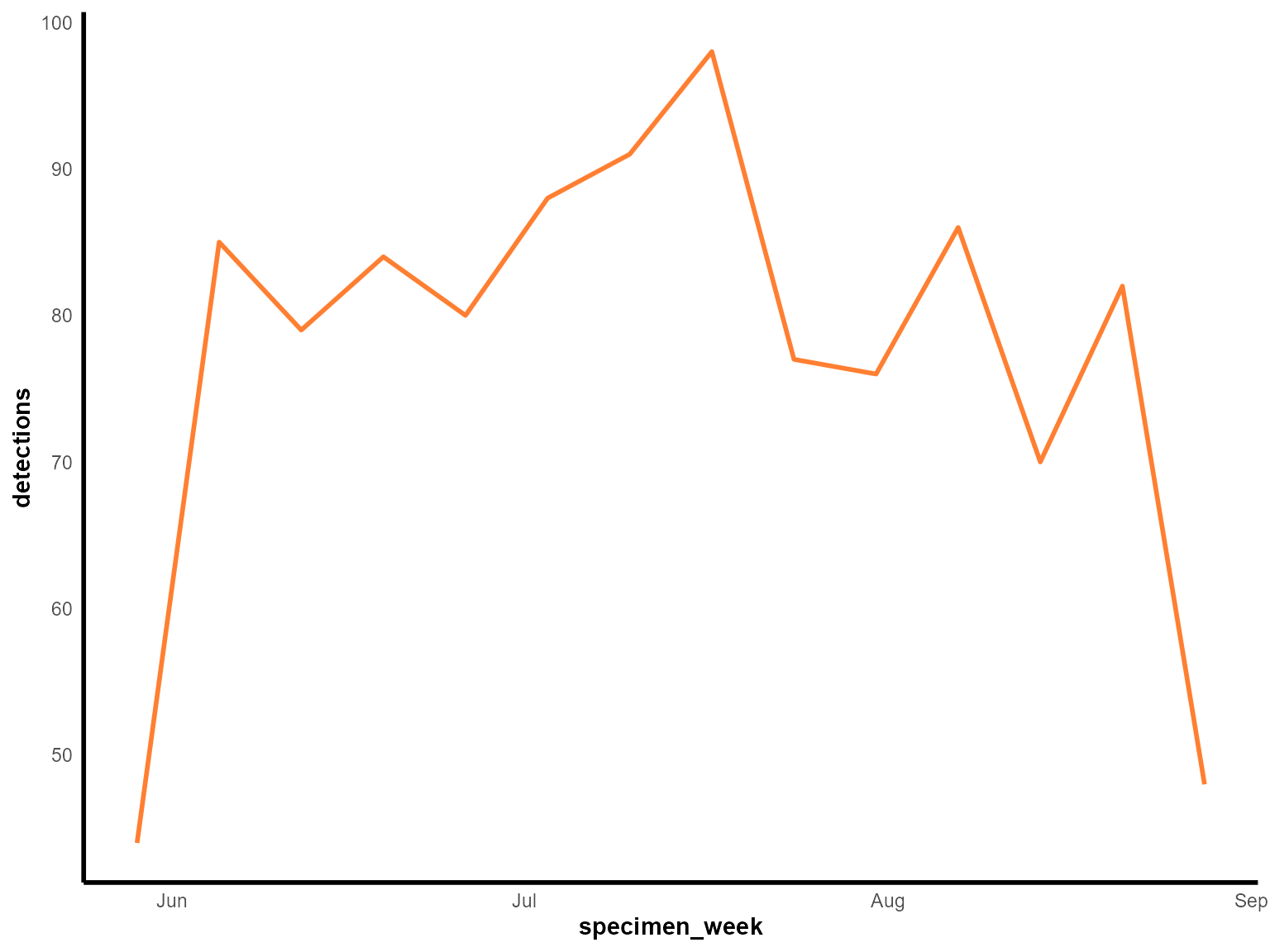
Weekly Staphylococcus aureus detections during summer 2023.
Interpretation: This enhanced line chart provides a detailed view of weekly patterns during the summer period, with custom styling for better visual presentation.
Tips for line charts
Data preparation: Always ensure your data is properly aggregated and formatted as a data frame before passing it to the function.
Date handling: Ensure your date variable is properly formatted as Date class for correct temporal visualisation.
Grouping: Use
group_varto create multiple lines for comparison. Each group will get a different color and line style.-
Line styling: Customize appearance with:
-
line_colour: Vector of colors for different series -
line_type: Vector of line styles (“solid”, “dotted”, “dashed”)
-
Color choices: Choose colors that are distinguishable and accessible, especially important when grouping multiple categories.
Interactive features: Set
dynamic = TRUEfor interactive charts with zooming, hovering, and filtering capabilities.Data frame conversion: Always use
as.data.frame()to ensure your data is in the correct format, as shown in the test examples.Time period selection: Choose appropriate time periods (daily, weekly, monthly) based on your analysis needs and the expected patterns in your data.
Multiple series: When comparing multiple time series, ensure all series have data for the same time periods to avoid gaps in the visualisation.
Line types: Use different line types (
"solid","dotted","dashed") to distinguish between series, especially useful for black and white printing.Data validation: Always check that your aggregated data covers the expected time periods and that counts are reasonable before visualisation.