Introduction
Epidemiological maps are powerful tools for visualizing the
geographic distribution of disease cases, helping identify spatial
clusters, regional patterns, and areas of concern. The
epi_map() function creates choropleth maps using spatial
boundary data, allowing you to overlay epidemiological data on
geographic regions. The function supports both static (ggplot2) and
interactive (leaflet) maps with extensive customization options.
Example 1: Static map with un-merged shapefile
Local authority maps provide detailed spatial resolution for outbreak investigation and local surveillance. This example shows Staph aureus detections by London local authorities using an un-merged shapefile approach.
Create the static map with un-merged shapefile
epi_map(
  dynamic = FALSE,  # Create static map
  params = list(
    df = london_detections,
    value_col = "detections",           # Variable containing values to map
    data_areacode = "local_authority_name",  # Variable containing area names
    inc_shp = FALSE,                    # Use un-merged shapefile approach
    shp_name = epiviz::London_LA_boundaries_2023,  # Spatial boundary data
    shp_areacode = "LAD23NM",          # Variable in boundary data matching area names
    fill_palette = "Blues",            # Color palette
    fill_opacity = 1.0,                # Opacity of filled areas
    break_intervals = NULL,            # Use automatic breaks
    break_labels = NULL,               # Use automatic labels
    force_cat = TRUE,                  # Force categorical breaks
    n_breaks = NULL,                   # Use default number of breaks
    labels = NULL,                     # No custom labels
    map_title = "Staphylococcus Aureus detections in London Local Authority Districts",
    map_title_size = 13,
    map_title_colour = "black",
    map_footer = "",
    map_footer_size = 12,
    map_footer_colour = "black",
    area_labels = TRUE,                # Show area labels
    area_labels_topn = NULL,           # Show all areas
    legend_title = "Number of \nDetections",
    legend_pos = "right",
    map_zoom = data.frame(LONG = c(-0.12776), LAT = c(51.50735), zoom = c(8.7)),  # London center
    border_shape_name = NULL,          # No border shapefile
    border_code_col = NULL,
    border_areaname = NULL
  )
)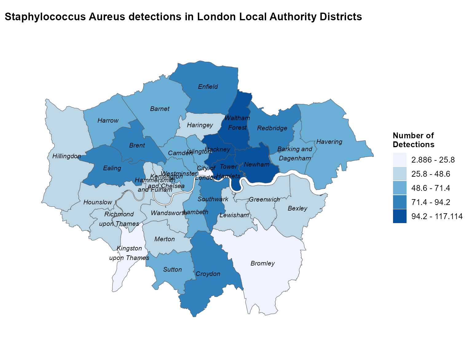
Static choropleth of Staphylococcus aureus detections across London local authorities.
Interpretation: This map reveals the spatial distribution of Staph aureus detections across London local authorities, highlighting areas with higher case counts that may require targeted public health interventions.
Example 2: Static map with pre-merged shapefile
When you have already merged your data with spatial boundaries, you can use the pre-merged approach for more control over the mapping process.
Prepare the pre-merged data
# Aggregate detections by region
regional_detections <- epiviz::lab_data %>%
  filter(organism_species_name == "KLEBSIELLA PNEUMONIAE") %>%
  group_by(region) %>%
  summarise(detections = n(), .groups = "drop") %>%
  mutate(map_labels = paste0(region, ": \n", detections))  # Create custom labels

# Get the shapefile
shape <- epiviz::PHEC_boundaries_2016

# Merge data with shapefile
merged_data <- left_join(x = shape, y = regional_detections,
                        by = c("phec16nm" = "region"))
Create the static map with pre-merged data
epi_map(
  dynamic = FALSE,  # Create static map
  params = list(
    df = merged_data,                  # Pre-merged data
    value_col = "detections",
    data_areacode = "phec16nm",        # Area code in merged data
    inc_shp = TRUE,                    # Use pre-merged approach
    shp_name = NULL,                   # No separate shapefile needed
    shp_areacode = NULL,               # No separate shapefile needed
    fill_palette = "YlOrRd",          # Yellow to red palette
    fill_opacity = 0.7,                # Semi-transparent fill
    break_intervals = c(0, 500, 1000, 1500, 2000, 2500),  # Custom break intervals
    break_labels = c("0-499", "500-999", "1000-1499", "1500-1999", "2000-2499", "2500+"),  # Custom labels
    force_cat = TRUE,                  # Force categorical breaks
    n_breaks = NULL,
    labels = "map_labels",             # Use custom labels
    map_title = "Number of Klebsiella Pneumoniae detections \nin UK public health regions",
    map_title_size = 12,
    map_title_colour = "orangered",
    map_footer = "Map represents simulated test data only.",
    map_footer_size = 10,
    map_footer_colour = "black",
    area_labels = FALSE,               # Don't show area labels (using custom labels)
    area_labels_topn = NULL,
    legend_title = "Number of \nDetections",
    legend_pos = "topright",
    map_zoom = NULL,                   # Use default zoom
    border_shape_name = NULL,
    border_code_col = NULL,
    border_areaname = NULL
  )
)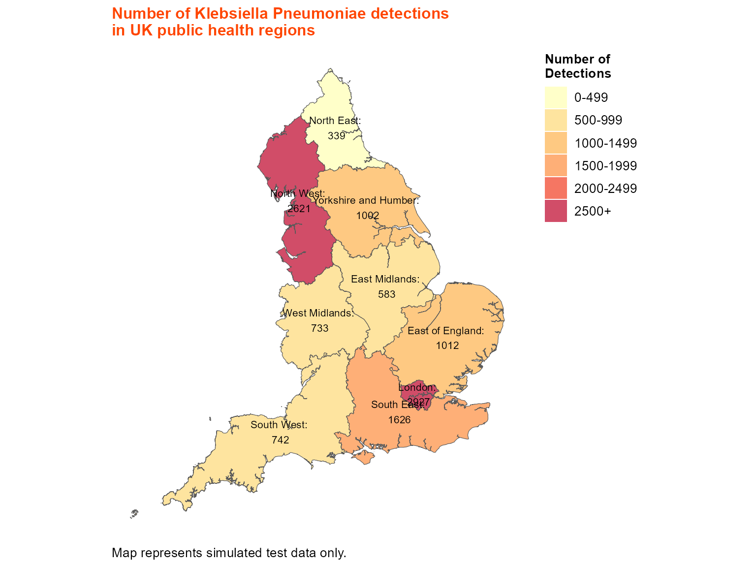
Static choropleth of Klebsiella pneumoniae detections across UK public health regions.
Interpretation: This map shows the regional distribution of Klebsiella pneumoniae detections across UK public health regions, with custom break intervals and labels for better interpretation.
Example 3: Static map with border shapefile
Border shapefiles allow you to add additional geographic context, such as country boundaries or administrative regions.
Create the map with border shapefile
# Use the same regional data
regional_detections <- epiviz::lab_data %>%
  filter(organism_species_name == "KLEBSIELLA PNEUMONIAE") %>%
  group_by(region) %>%
  summarise(detections = n(), .groups = "drop") %>%
  mutate(map_labels = paste0(region, ": \n", detections))

# Get shapefiles
shape <- epiviz::PHEC_boundaries_2016
border_shape <- epiviz::UK_boundaries_2023

epi_map(
  dynamic = FALSE,  # Create static map
  params = list(
    df = regional_detections,
    value_col = "detections",
    data_areacode = "region",
    inc_shp = FALSE,                   # Use un-merged approach
    shp_name = shape,                  # Main shapefile
    shp_areacode = "phec16nm",         # Area code in main shapefile
    fill_palette = "YlOrRd",
    fill_opacity = 0.7,
    break_intervals = c(0, 500, 1000, 1500, 2000, 2500),
    break_labels = c("0-499", "500-999", "1000-1499", "1500-1999", "2000-2499", "2500+"),
    force_cat = TRUE,
    n_breaks = NULL,
    labels = "map_labels",
    map_title = "Number of Klebsiella Pneumoniae detections \nin UK public health regions",
    map_title_size = 12,
    map_title_colour = "orangered",
    map_footer = "Map represents simulated test data only.",
    map_footer_size = 10,
    map_footer_colour = "black",
    area_labels = FALSE,
    area_labels_topn = NULL,
    legend_title = "Number of \nDetections",
    legend_pos = "topright",
    map_zoom = NULL,
    # Border shapefile parameters
    border_shape_name = border_shape,  # Border shapefile
    border_code_col = "CTRY23NM",     # Area code in border shapefile
    border_areaname = c("Wales", "Northern Ireland", "Scotland")  # Areas to highlight
  )
)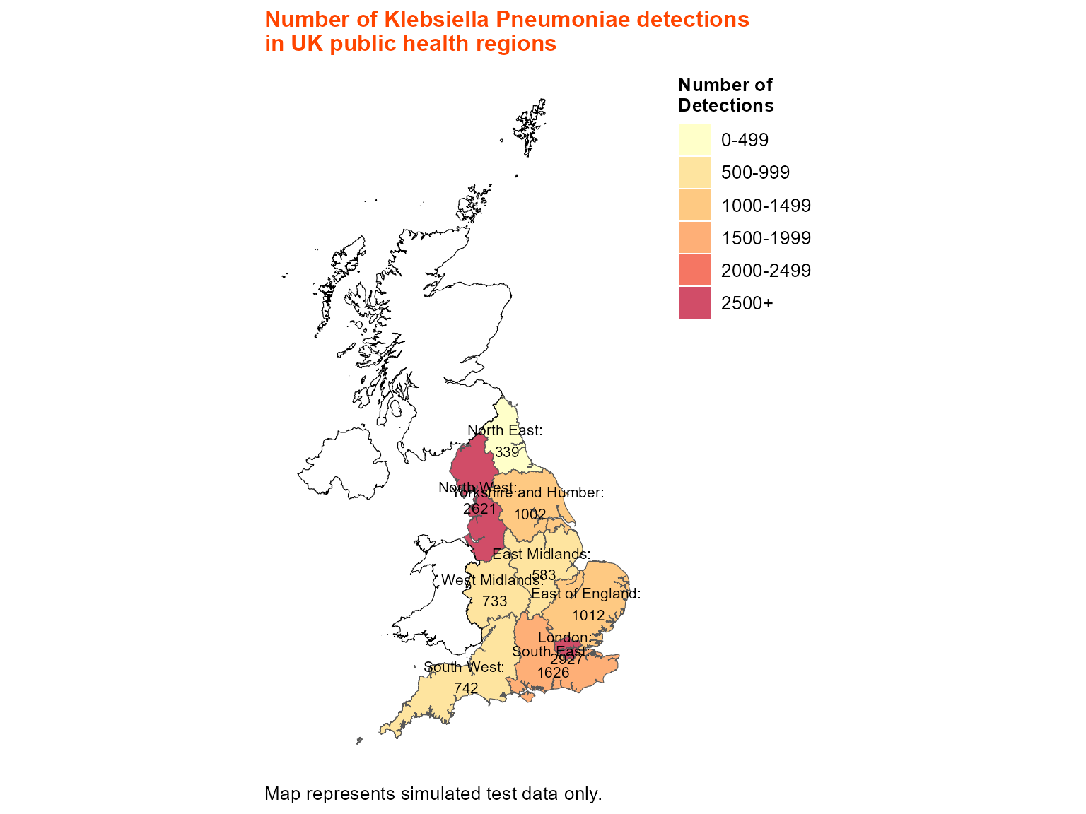
Static choropleth with UK country border overlays.
Interpretation: This map includes border shapefiles to show country boundaries, providing additional geographic context for the regional analysis.
Example 4: Interactive map with un-merged shapefile
Interactive maps are ideal for surveillance dashboards, allowing users to zoom, pan, and hover for detailed information.
Create the interactive map
epi_map(
  dynamic = TRUE,   # Create interactive leaflet map
  params = list(
    df = london_detections,
    value_col = "detections",
    data_areacode = "local_authority_name",
    inc_shp = FALSE,
    shp_name = epiviz::London_LA_boundaries_2023,
    shp_areacode = "LAD23NM",
    fill_palette = "Blues",
    fill_opacity = 1.0,
    break_intervals = NULL,
    break_labels = NULL,
    force_cat = TRUE,
    n_breaks = NULL,
    labels = NULL,
    map_title = "Staphylococcus Aureus detections in London Local Authority Districts",
    map_title_size = 13,
    map_title_colour = "black",
    map_footer = "",
    map_footer_size = 12,
    map_footer_colour = "black",
    area_labels = TRUE,
    area_labels_topn = NULL,
    legend_title = "Number of \nDetections",
    legend_pos = "topright",
    map_zoom = data.frame(LONG = c(-0.12776), LAT = c(51.50735), zoom = c(8.7)),
    border_shape_name = NULL,
    border_code_col = NULL,
    border_areaname = NULL
  )
)
Interactive choropleth of Staphylococcus aureus detections across London.
Interpretation: The interactive map allows detailed exploration of the spatial distribution, with hover information showing exact detection counts for each local authority.
Example 5: Interactive map with border shapefile and area labels
Interactive maps can include border shapefiles and custom area labeling for comprehensive geographic analysis.
Create the interactive map with borders and labels
epi_map(
  dynamic = TRUE,   # Create interactive leaflet map
  params = list(
    df = regional_detections,
    value_col = "detections",
    data_areacode = "region",
    inc_shp = FALSE,
    shp_name = shape,
    shp_areacode = "phec16nm",
    fill_palette = "YlOrRd",
    fill_opacity = 0.7,
    break_intervals = c(0, 500, 1000, 1500, 2000, 2500),
    break_labels = c("0-499", "500-999", "1000-1499", "1500-1999", "2000-2499", "2500+"),
    force_cat = TRUE,
    n_breaks = NULL,
    labels = "map_labels",
    map_title = "Number of Klebsiella Pneumoniae detections \nin UK public health regions",
    map_title_size = 12,
    map_title_colour = "orangered",
    map_footer = "Map represents simulated test data only.",
    map_footer_size = 10,
    map_footer_colour = "black",
    area_labels = TRUE,                # Show area labels
    area_labels_topn = 5,              # Show top 5 areas
    legend_title = "Number of \nDetections",
    legend_pos = "topright",
    map_zoom = data.frame(LONG = c(-2.89479), LAT = c(54.793409), zoom = c(5)),  # UK center
    border_shape_name = border_shape,
    border_code_col = "CTRY23NM",
    border_areaname = c("Wales", "Northern Ireland", "Scotland")
  )
)
Interactive choropleth of Klebsiella pneumoniae detections with country borders and labels.
Interpretation: This comprehensive interactive map combines regional data visualization with country borders and area labeling, providing multiple layers of geographic information for surveillance analysis.
Tips for epidemiological maps
Data preparation: Always aggregate your epidemiological data to the appropriate geographic level before mapping. The function expects pre-calculated counts or values.
-
Shapefile approaches:
-
Un-merged (
inc_shp = FALSE): Use when you have separate data and shapefile -
Pre-merged (
inc_shp = TRUE): Use when you’ve already joined data with spatial boundaries
-
Un-merged (
Area code matching: Ensure your area names in the data exactly match the names in the boundary data. Use
unique()to check for mismatches.-
Color palettes: Choose appropriate color schemes:
-
"Blues"for general use -
"YlOrRd"for intensity (yellow to red) -
"Reds"for high values -
"Greens"for positive indicators
-
-
Break intervals: Use custom
break_intervalsandbreak_labelsfor meaningful categorization: -
Map zoom: Use
map_zoomto center and zoom the map appropriately:map_zoom = data.frame(LONG = c(-0.12776), LAT = c(51.50735), zoom = c(8.7)) Border shapefiles: Add
border_shape_namefor additional geographic context like country boundaries.Area labels: Use
area_labels = TRUEandarea_labels_topnto show labels for the most important areas.Interactive features: Set
dynamic = TRUEfor interactive maps with zooming, panning, and hover information.Opacity: Adjust
fill_opacity(0-1) to control transparency of filled areas.Legend positioning: Use
legend_posto place the legend where it doesn’t obscure important map features.Custom labels: Create custom labels in your data for more informative hover text and area labels.