Introduction
The epiviz package provides epidemiological
visualization functions for creating both static (ggplot2) and
interactive (plotly) charts commonly used in public health surveillance
and outbreak investigation. This guide introduces you to the package
using the built-in lab_data dataset.
The lab_data dataset
lab_data is a synthetic laboratory dataset included with
epiviz for demonstration purposes. It contains simulated laboratory
detection data with typical epidemiological variables:
## Rows: 32,560
## Columns: 8
## $ date_of_birth         <date> 1938-10-05, 1957-04-04, 1927-06-24, 1962-06-14,…
## $ sex                   <fct> Female, Male, Male, Male, Male, Male, Male, Male…
## $ organism_species_name <fct> KLEBSIELLA PNEUMONIAE, KLEBSIELLA PNEUMONIAE, ST…
## $ specimen_date         <date> 2020-05-24, 2023-07-08, 2023-02-24, 2023-08-26,…
## $ lab_code              <fct> BI20985, JH70033, CU5997, ES3851, YA29556, QF111…
## $ local_authority_name  <chr> "Worthing", "Reading", "Plymouth", "Cheshire Wes…
## $ local_authority_code  <chr> "E07000229", "E06000038", "E06000026", "E0600005…
## $ region                <chr> "South East", "South East", "South West", "North…
The dataset includes: - Patient demographics:
date_of_birth, sex - Laboratory
information: organism_species_name,
specimen_date, lab_code - Geographic
data: local_authority_name,
local_authority_code, region
Example 1: Regional distribution of detections
When analyzing laboratory surveillance data, we often want to understand the geographic distribution of detections. Here we’ll create a simple column chart showing detections by region for a specific time period.
Prepare the data
# Filter to a specific time period and aggregate by region
regional_detections <- epiviz::lab_data %>%
  filter(
    specimen_date >= as.Date("2023-01-01"),
    specimen_date <= as.Date("2023-01-31")
  ) %>%
  count(region, name = "detections") %>%
  arrange(desc(detections)) %>%
  slice(1:6) %>%  # Keep top 6 regions for readability
  mutate(
    # Handle long region names for better display
    region = ifelse(region == "Yorkshire and Humber",
                   "Yorkshire and\nHumber", region)
  )
Create the visualization
col_chart(
  dynamic = FALSE,  # Create static ggplot chart
  params = list(
    df = regional_detections,
    x = "region",           # Variable for x-axis
    y = "detections",       # Variable for y-axis
    fill_colours = "#007C91",  # Single color for all bars
    chart_title = "Laboratory detections by region (January 2023)",
    x_axis_title = "Region",
    y_axis_title = "Number of detections",
    x_axis_label_angle = -45,  # Rotate labels for readability
    show_gridlines = FALSE     # Remove grid lines for cleaner look
  )
)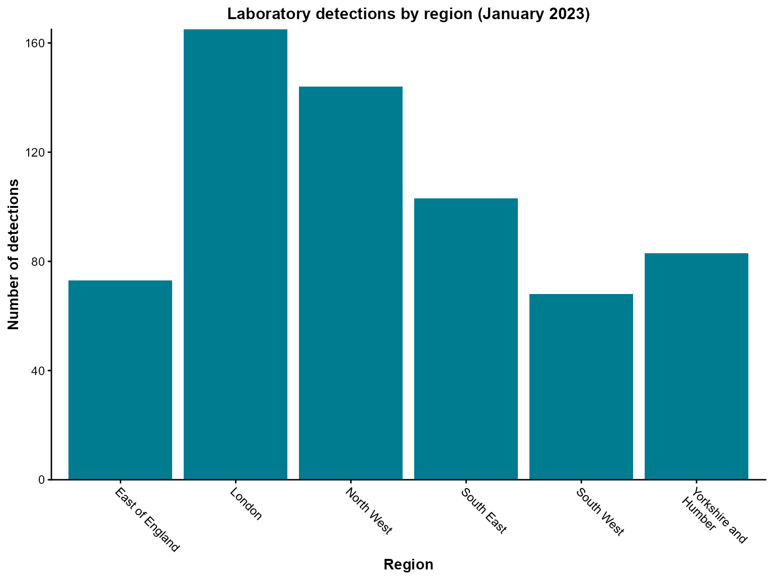
Interpretation: This chart shows the regional distribution of laboratory detections in January 2023, with London having the highest number of detections.
Example 2: Temporal trends in detections
Time series analysis is fundamental in epidemiological surveillance. Here we’ll create a line chart showing monthly trends in detections over a two-year period.
Create the visualization
line_chart(
  dynamic = FALSE,  # Create static ggplot chart
  params = list(
    dfr = monthly_detections,   # Note: use 'dfr' parameter for line_chart
    x = "specimen_month",      # Date variable for x-axis
    y = "detections",          # Count variable for y-axis
    line_colour = c("#007C91"), # Color for the line (vector format)
    line_type = c("solid")     # Line type
  )
)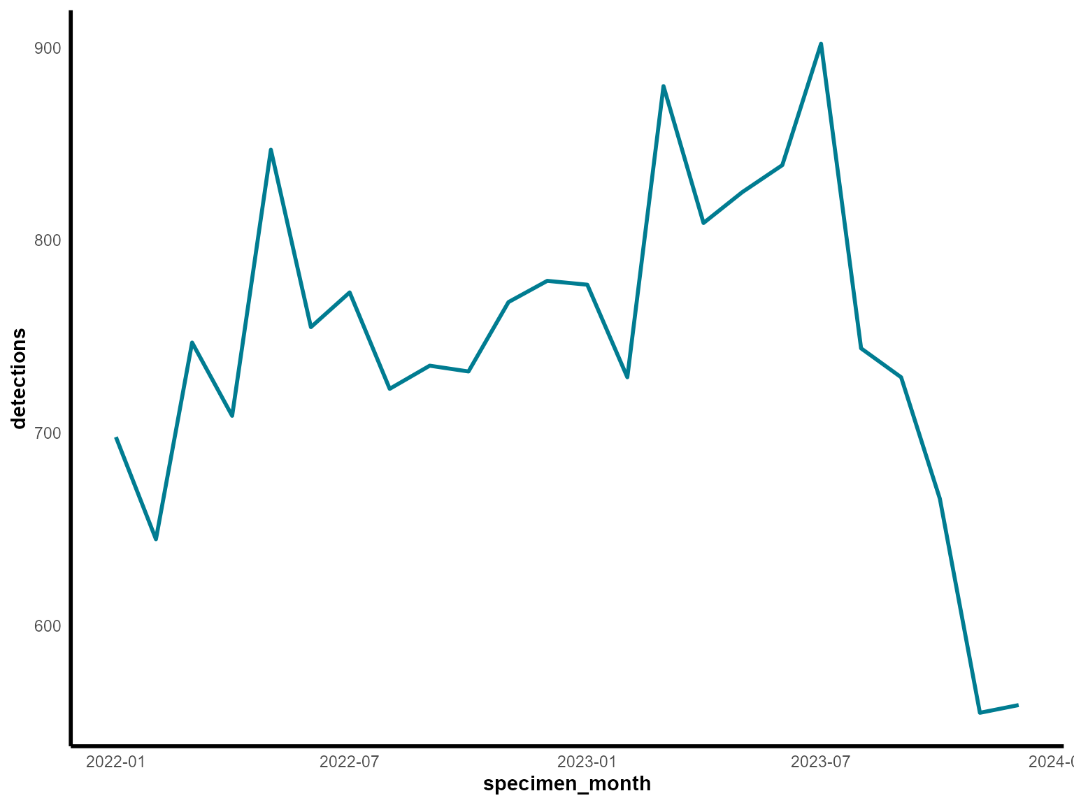
Interpretation: This line chart reveals seasonal patterns in laboratory detections, with potential peaks and troughs throughout the two-year period.
Tips for getting started
Start with static charts: Use
dynamic = FALSEinitially to create ggplot2 charts, then switch todynamic = TRUEfor interactive plotly charts when you need zooming, hovering, or filtering capabilities.Filter your data: The
lab_datadataset is quite large. Always filter to specific time periods, regions, or organisms to create readable visualizations.Check your data structure: Use
glimpse()orstr()to understand your data before passing it to visualization functions.Parameter naming: Most functions use a
paramslist to organize parameters. This keeps function calls clean and allows for easy parameter reuse.Color consistency: Use consistent color schemes across your visualizations. The package provides sensible defaults, but you can customize colors using the
*_coloursparameters.